
Your website looked great when you launched it. Clean layout. Good colors. Professional enough that handing out your business card felt comfortable. That was two or three years ago.
Today, a visitor lands on your site, takes about three seconds to form an impression, and either stays – or bounces to a competitor whose site feels sharper, faster, and more current. They can’t explain why they left. They just felt like the other business looked more credible.
Design does that. And in 2026, the gap between websites that win trust instantly and websites that quietly lose it has never been wider.
This guide covers the website design trends 2026 is bringing to the front – not as a gimmick checklist, but as a practical breakdown of what’s moving the needle for small and mid-sized businesses competing in local markets right now.
Trends only move the needle when your site’s foundation is solid. If you’re starting fresh or rethinking your current setup entirely, our Palm Harbor small business website design guide covers platform decisions, conversion strategy, cost, and mobile optimization before you commit to any design direction.
Before the Trend List – Find Your Starting Point First
Not every trend belongs on every site. Before the full breakdown, here’s a quick decision filter so you know where to focus:
- High bounce rate on your homepage? Start with Trends 2 and 6 – minimalism and bold typography directly address this.
- Google rankings have dropped in the past six months? Start with Trend 3 – mobile-first and page speed optimization are the most likely culprits.
- Quote forms or CTAs not converting? Focus on Trends 4 and 5 – micro-animations and scroll design close that gap.
- Not sure where your site stands? Read all seven and use the priority matrix at the bottom.
Use the breakdown below to go deeper on whichever applies to your situation.
Why Website Design Trends 2026 Actually Matter for Local Businesses
Here’s the honest context before the list.
Most small businesses don’t need to redesign their website every year. But ignoring design evolution for three or more years creates a real and measurable problem: your site starts to signal “behind the times” to visitors who compare dozens of websites a day and make instant, subconscious judgments.
According to Google’s own research, 53% of mobile users abandon a site that takes longer than three seconds to load – and the majority of local service searches now happen on mobile devices. That’s not a design preference. That’s direct, measurable revenue walking out the door before your homepage finishes loading.
For service businesses in Palm Harbor, Clearwater, and across the Tampa Bay area competing for the same local customer pool, that number translates to a concrete decision: your site either loads fast and earns trust in the first three seconds, or it doesn’t – and the visitor calls your competitor instead.
The latest web design trends covered below aren’t about aesthetics for their own sake. Each one connects directly to how users behave, how Google evaluates your site, and how quickly visitors decide whether your business is worth their time.
1. AI-Assisted Personalization Without the Complexity
Personalization used to require enterprise-level budgets. In 2026, it’s accessible to small businesses in ways that genuinely improve engagement without rebuilding your entire site.
This means smart, lightweight UX design best practices – showing returning visitors the service they viewed last time, surfacing location-specific content for Tampa Bay area users, or adjusting calls to action based on which page a visitor arrived from.
What this looks like in practice: A Palm Harbor HVAC company sets up a simple rule – anyone who lands on the “AC repair” page sees a repair-specific CTA on every subsequent page they visit, rather than a generic “contact us” button that applies to no one specifically. Setup takes hours. The conversion impact compounds over months.
The modern web design idea here is straightforward: your website should feel like it understands why the visitor showed up. Even lightweight personalization signals reduce bounce rates and increase the likelihood of a lead.
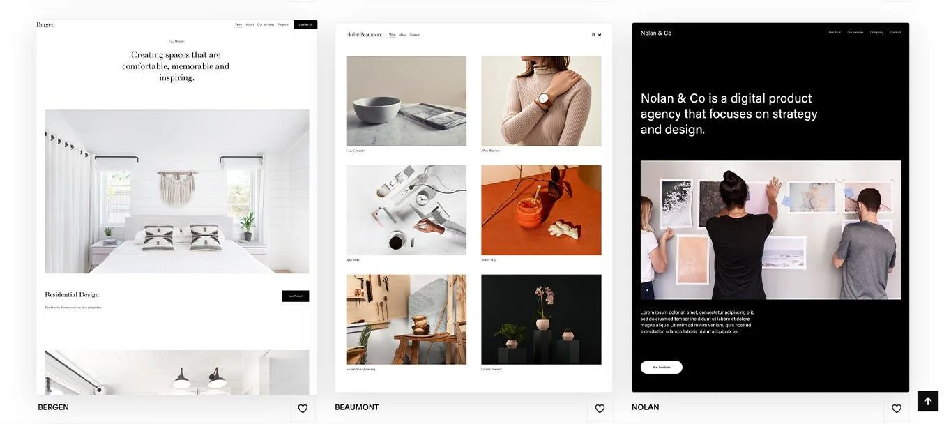
2. Purposeful Minimalism – One Message Per Screen, Zero Decoration
One of the strongest UI trends moving into 2026 is a direct reaction against visual clutter. Purposeful minimalism strips websites to what actually works: one dominant above the fold design message per screen, generous white space, bold typography, and zero decorative elements that don’t serve a conversion purpose.
This isn’t reserved for tech companies. Local service businesses – contractors, dentists, law firms, medical practices – benefit enormously from this approach because it forces clarity. When a site can only say one thing per section, weak messaging has nowhere to hide behind busy design.
What this looks like in practice: A Palm Harbor law firm replaces its five-column homepage with a single above the fold statement, one supporting line, and one CTA button. The contact form completion rate increases because visitors no longer have to decide which of five things to click first.
The practical result: visitors understand your offer faster, stay on the page longer, and convert at higher rates because friction disappears.
Trends are only useful when they translate into specific, actionable site elements. Our guide to website features aligned with 2026 design standards connects the what-to-implement with the how – with placement guidance for each feature your site should include this year.
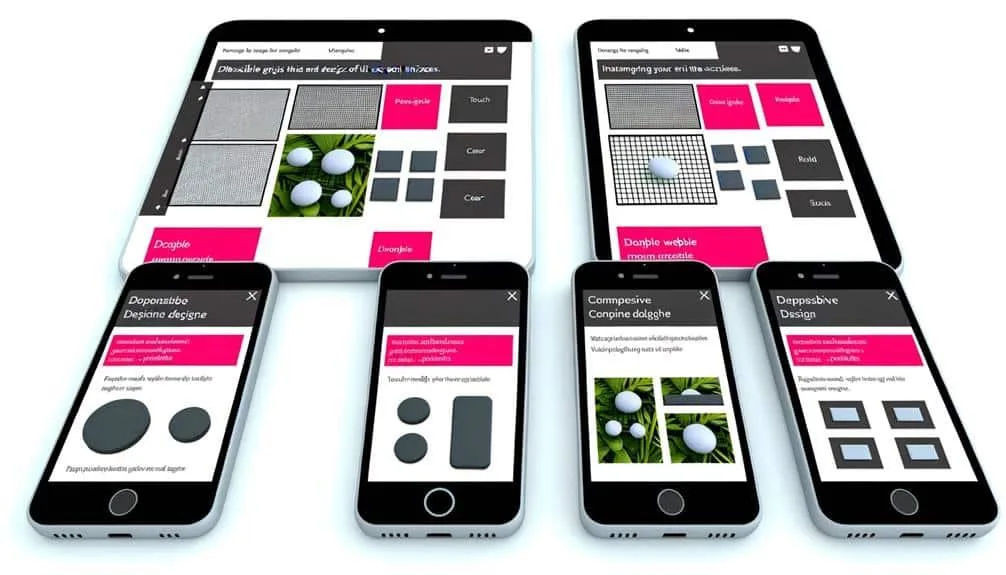
3. Mobile-First Design and Page Speed Optimization Are Now the Baseline
Google switched to mobile-first indexing in 2023. In 2026, the majority of local service searches happen on phones – and this is still the reality most small business websites haven’t fully adapted to.
Mobile-first development isn’t just a trend – it’s the foundation everything else builds on. Our guide to mobile-first design trends for 2026 goes deeper into what responsive design, Core Web Vitals, and local search behaviour mean for Palm Harbor service businesses specifically.
The latest web design trends reflect this at the structural level. Mobile-first means the mobile experience gets built first and the desktop version scales up from it – not the other way around. This produces faster load times, better Core Web Vitals scores, and cleaner layouts on smaller screens. Combined with serious page speed optimization – compressed images, clean code, minimal plugin dependencies – it’s the foundation every other trend on this list depends on.
What this looks like in practice: A Clearwater contractor’s site moves from a 6.2-second mobile load time to 1.8 seconds after a mobile-first rebuild with page speed optimization built in. Their Google Search Console shows a 34% drop in bounce rate within 60 days – without changing a single word of their content.
If your site loads slowly or the phone number isn’t immediately tappable, you lose the visitor before the page finishes rendering. Page speed optimization isn’t optional in 2026. It’s the price of admission.
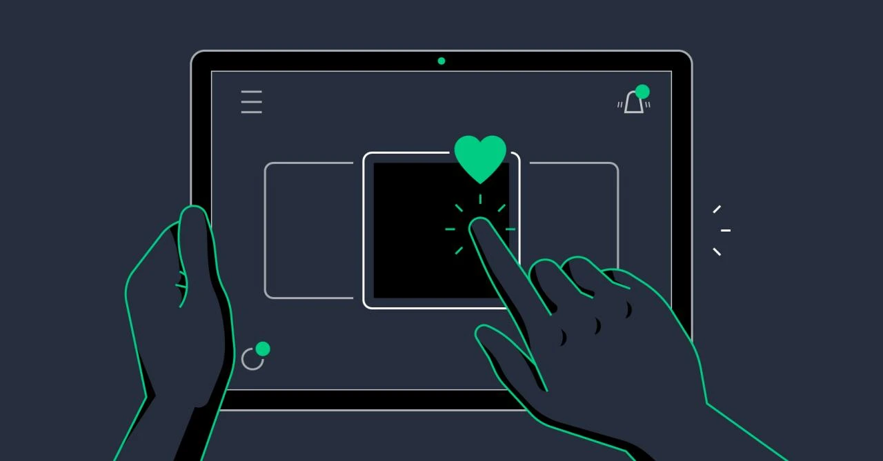
4. Micro-Animations That Guide – Not Distract
Micro-animations are small, purposeful motion elements – a button that subtly shifts on hover, a form field that highlights when clicked, a progress indicator that moves as a user fills out a quote request.
Done poorly, animations slow a website and frustrate users. Done correctly – which is what 2026 UX design best practices emphasize – they reduce friction and guide visitors toward the actions you want them to take.
What this looks like in practice: A medical practice adds a single subtle pulse animation to their “Book an Appointment” button – it activates only when the user’s cursor pauses nearby, not on page load. That one change increases CTA click-through on the homepage by drawing the eye at the precise moment the visitor is deciding whether to act.
The rule is simple: animations should respond to user behavior, not run in the background for visual effect. One well-placed animation on your primary CTA is worth more than a homepage that plays an auto-loading video nobody watches past the first three seconds.
5. Scroll-Triggered Storytelling
Visitors don’t read websites. They scroll. The best-performing small business websites in 2026 are designed around that reality.
Scroll-triggered storytelling means content reveals itself progressively as the user moves down the page – text fades in, images slide into position, key stats animate into view as they become visible. The page feels dynamic and responsive rather than static.
What this looks like in practice: A Palm Harbor remodeling contractor replaces their static “Our Process” numbered list with a scroll-triggered sequence – each step reveals itself as the visitor scrolls down, with a brief line of supporting detail appearing beneath it. Visitors now reach the quote request form at the bottom of the page at twice the rate they did before, because the scroll feels rewarding enough to complete.
Users who scroll further down a page convert at significantly higher rates. Scroll-triggered design earns that depth by making the journey feel intentional.
6. Bold Typography and Website Color Trends 2026
In 2026, headlines are doing structural work that used to require photography. Large-scale, high-contrast typography – a single powerful statement spanning the full width of the screen – creates instant visual hierarchy without relying on brand images you may not have.
Website color trends 2026 reinforce this shift: deep, saturated single-color backgrounds paired with high-contrast white or cream type are replacing the gradient-heavy, multi-color palettes that dominated the previous three years. The effect is confident, fast-loading, and immediately readable on mobile.
What this looks like in practice: A Tampa Bay accounting firm replaces a rotating homepage slider with a single full-width headline – “We Handle the Numbers. You Run the Business.” – in 72px bold type on a deep navy background. The page loads in under two seconds, the message lands in under three, and the CTA sits directly below with nothing competing for attention.
For local businesses with limited brand photography budgets, bold typography paired with current website color trends is both a practical solution and a contemporary design statement.
Knowing which trends to adopt matters less if you haven’t removed the elements quietly undermining your credibility. Our guide to design mistakes that make your site look outdated in 2026 identifies the five most common errors still appearing on Tampa Bay small business websites – and how to fix each one fast.
7. Accessibility as a Competitive Advantage – Not a Checkbox
Accessible design – appropriate color contrast, keyboard navigation, alt text, readable font sizes, clear link labels – has been a legal and ethical consideration for years. In 2026, it’s also a direct ranking factor.
Google’s Core Web Vitals and page experience signals increasingly reward websites that serve all users well. Businesses that build accessible sites from the ground up have fewer expensive structural corrections to make as standards evolve and ADA compliance enforcement increases across industries.
For medical practices, legal firms, nonprofits, and e-commerce businesses across the Tampa Bay area, accessibility isn’t a nice-to-have. It directly determines which customers can use your site – and how favorably Google evaluates it against competitors.
Expert Insight: Trends Are Only Valuable When They Serve a Business Goal
“Every year we see local businesses chase design trends that look great in a portfolio but don’t connect to a real business outcome. In 2026, the websites that perform best for our clients in Palm Harbor and across Tampa Bay aren’t the most visually complex – they’re the ones where every design decision ties back to one question: does this make it easier or harder for the right person to take the next step? That’s the filter we apply before any trend makes it into a build. A website redesign checklist helps, but the honest conversation about business goals has to come first.”
– Vinnie Campagna, Founder, West Bay Websites
Which 2026 Trends Should Your Business Prioritize?
| Problem Your Site Has | Trend to Address First | Effort | Impact |
| Slow mobile load / low Google ranking | Mobile-first + Page Speed Optimization | Full rebuild | High |
| High homepage bounce rate | Purposeful minimalism + Bold typography | Mid-project | High |
| Low CTA or form conversion | Micro-animations on CTAs | Quick win | Medium |
| Visitors drop off mid-page | Scroll-triggered storytelling | Mid-project | High |
| Site feels generic or outdated | Website color trends + Above the fold refresh | Quick win–mid | Medium |
| Returning visitors don’t convert | AI-assisted personalization | Quick win | Medium |
| Accessibility or compliance concerns | Accessibility audit and rebuild | Mid-project | High |
Is Your Website Ready for 2026?
Keeping up with website design trends 2026 brings doesn’t mean chasing what looks new. It means making sure your site earns trust in three seconds, keeps visitors engaged long enough to act, and turns browsers into leads – consistently.
A solid website redesign checklist starts with honest answers to three questions: How fast does your site load on mobile? What’s your bounce rate on your most important pages? And when a visitor lands on your homepage for the first time, does the above the fold design tell them immediately what you do, who you serve, and what to do next?
If you’re a local business in Palm Harbor, Clearwater, Dunedin, or anywhere across the Tampa Bay area and your website hasn’t been reviewed in the past two years, the gap between where it is and where 2026 standards sit is likely costing you real inquiries every week.
Book your free 20-minute website review. We’ll assess your current site against 2026 benchmarks, identify the specific changes that would move your conversion rate, and give you a clear picture of what a refresh or full rebuild would involve – no obligation, no vague estimates, no pressure.