
The Hard Truth About Your Website
You built a website. You’re paying to keep it live. Maybe you even invested in ads to drive traffic. But the leads still aren’t coming in the way they should.
Here’s what most business owners in Palm Harbor and across the Tampa Bay area don’t realize – your website could be quietly pushing potential customers away before they ever contact you. These aren’t obvious problems. They’re subtle website mistakes losing leads every single day, and most business owners don’t catch them until the damage is already done.
These mistakes don’t exist in isolation they’re symptoms of a website that was never built with a clear strategy. If you want to understand what a high-converting site looks like from the ground up, our complete website design guide for Palm Harbor businesses covers every decision point before the first pixel gets designed.
The good news? Every one of these mistakes is fixable.
Quick Answer: What Website Mistakes Are Costing You Leads?
The five most common website mistakes that cost businesses leads are slow load times, weak or missing calls-to-action, poor mobile experience, lack of trust signals, and copy that focuses on the business instead of the customer’s problem. Each of these can be identified and fixed without rebuilding your entire website from scratch.
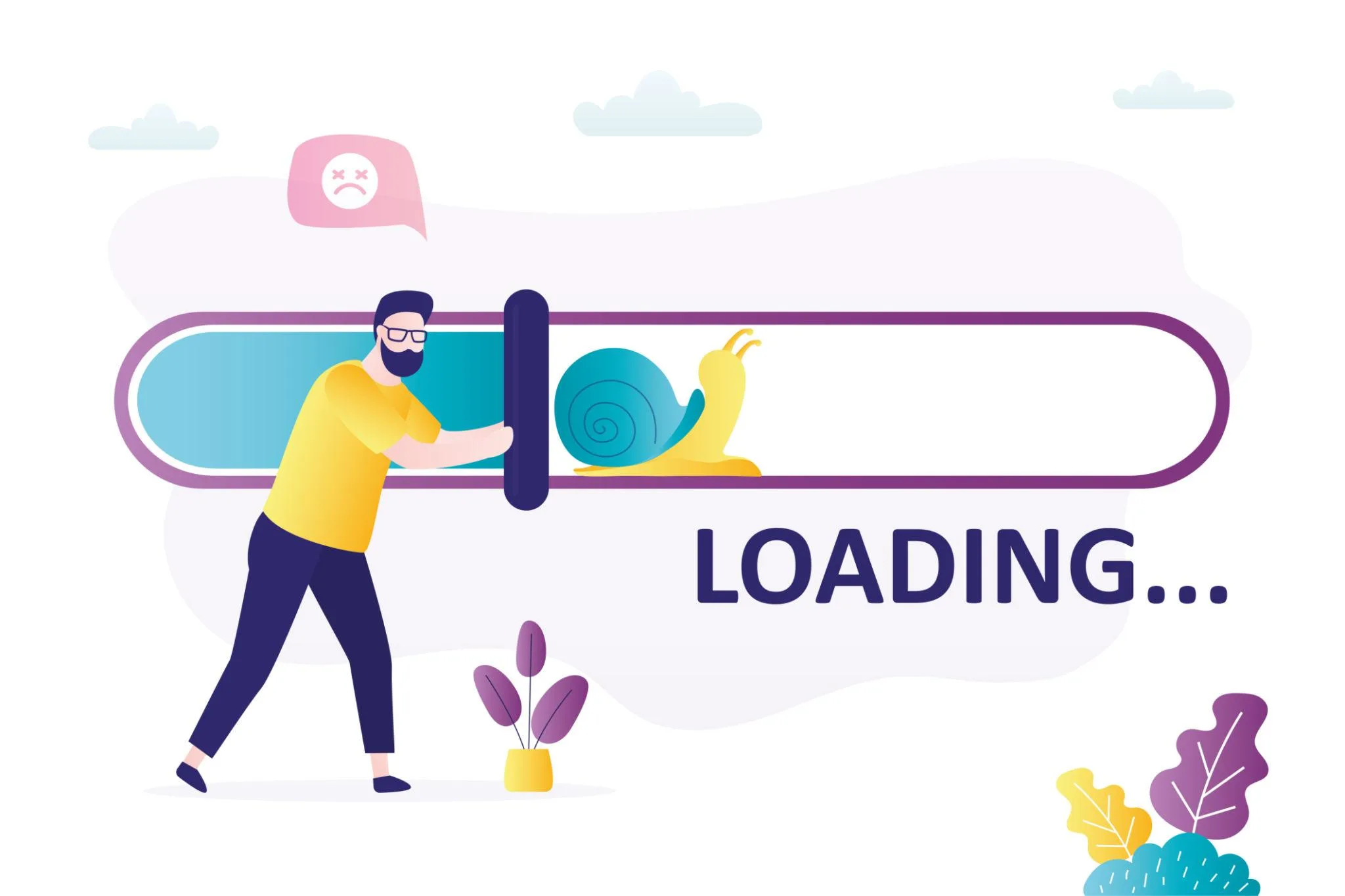
Mistake 1: Your Website Loads Too Slowly – And It’s Costing You More Than You Think
Speed isn’t just a convenience. It’s a conversion factor with a measurable dollar impact.
According to research by Portent, a website that loads in one second converts visitors at a rate three times higher than a website that loads in five seconds. That’s not a marginal difference – that’s the gap between a website that generates consistent leads and one that silently fails every single day.
A slow website also sends the wrong signal. Visitors assume that if your site feels outdated and sluggish, your business might be too. That’s not fair, but it’s the reality of how people form first impressions online.
What causes slow load times?
- Oversized images that haven’t been compressed
- Outdated hosting plans with limited server resources
- Too many unnecessary plugins or scripts running in the background
- No caching setup to speed up repeat visits
Run your website through Google Page Speed Insights today. If you’re scoring below 70 on mobile, this is almost certainly costing you leads.
Mistake 2: Your Call-to-Action Is Weak, Hidden, or Nonexistent
This is one of the most common lead generation mistakes small businesses make – and one of the easiest to overlook.
Visitors land on your website. They’re interested. But then they’re not sure what to do next. There’s no clear button, no obvious next step, no reason to reach out right now. So they leave.
A strong CTA tells your visitor exactly what action to take and gives them a reason to take it. “Contact Us” is not enough. “Get a Free Quote Today” or “Book Your Consultation” gives people a clear, low-risk reason to move forward.
Research from HubSpot shows that targeted, specific CTAs convert up to 202% better than generic button text. That single change – rewriting what your button says – can double the number of people who reach out.
Signs your CTA isn’t working:
- It’s buried at the bottom of the page
- It blends into the background with low contrast
- You have too many CTAs competing for attention
- There’s no urgency or value tied to the action
Every main page on your website – especially your homepage and service pages – should have one clear, prominent CTA above the fold. Don’t make people scroll to find out how to reach you.
Identifying what’s broken is step one. Knowing exactly what to replace it with is step two. Our full guide to the website features that fix your biggest conversion leaks covers the ten highest-impact elements – in the order that delivers results fastest.

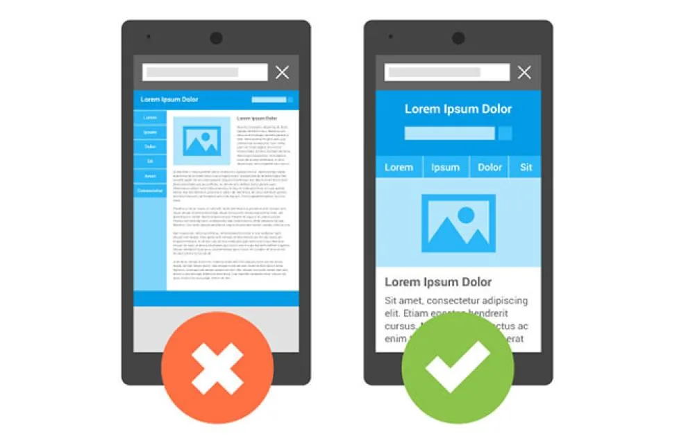
Mistake 3: Your Website Isn’t Built for Mobile Users
If your website still looks like it was designed for a desktop screen, you’re losing leads.
More than 60% of web traffic now comes from mobile devices. Service-based businesses in particular – contractors, home services, medical offices, legal professionals – get a huge share of their visitors from people searching on their phones while they’re on the go.
Google’s own research confirms the stakes: 61% of mobile users are unlikely to return to a website they had trouble accessing on their phone, and 40% go directly to a competitor’s site instead.
Classic bad UX examples on mobile:
- Text that’s too small to read without zooming in
- Buttons that are too close together and hard to tap
- Forms that don’t resize properly on smaller screens
- Navigation menus that are clunky or impossible to use on a phone
A mobile-unfriendly website doesn’t just frustrate visitors. It also tanks your Google rankings. Google uses mobile-first indexing, which means it evaluates your mobile experience first when deciding where to rank your site in search results.
If your website isn’t responsive, you’re losing on two fronts – visibility and conversions.
Mobile experience is deep enough to deserve its own dedicated attention. Our full guide to mobile website mistakes costing you leads covers the specific UX failures, ranking signals, and conversion gaps that a poor mobile setup creates – and exactly how to address each one.
Mistake 4: Your Website Doesn’t Build Trust
People do business with people (and businesses) they trust. Your website has about five to eight seconds to start building that trust before a visitor decides whether to stay or leave.
If your site looks generic, uses stock photos that feel disconnected, has no reviews, no real team information, and no clear “why us” – it feels risky to a new visitor. And risky means they move on to your competitor.
According to BrightLocal’s 2023 Local Consumer Review Survey, 98% of consumers read online reviews for local businesses before making a decision. If your website doesn’t surface social proof prominently, you’re asking visitors to take your word for it – and most won’t.
Trust signals that make a real difference:
- Genuine customer reviews and testimonials with names and locations
- Before-and-after results or case study examples
- A clear “About” section that shows a real team or founder story
- Local credibility – mentioning the Tampa Bay area or Palm Harbor specifically helps local visitors feel like you understand their community
- Certifications, affiliations, or years in business displayed prominently
Trust isn’t built through flashy design. It’s built through honesty, specificity, and proof. Show people you’ve done this before, you do it well, and your clients are happy.
What We See in Palm Harbor – A Pattern Worth Knowing
Across the local service businesses we’ve audited in Palm Harbor and the greater Tampa Bay area, Mistakes #2 and #4 almost always appear together.
A business has a decent-looking site. Traffic is coming in. But there’s no visible reviews section and the only CTA is a plain “Contact Us” link in the navigation. Visitors arrive, see no social proof, find no obvious next step, and leave within 30 seconds.
Both problems take less than a week to fix. But most owners don’t know they’re there – because the site looks fine on the surface. This is exactly why a structured website audit matters before spending another dollar on ads or SEO.

Mistake 5: Your Copy Talks About You Instead of Your Customer
This one is subtle but it’s a conversion killer. Read your homepage right now. How many times does it say “we,” “our team,” “our services,” or “we provide”? Now count how many times it addresses the customer’s problem directly.
Most business websites talk about themselves. They list services, credentials, and history. But visitors aren’t asking “who are you?” They’re asking “can you solve my problem?”
Your copy needs to answer that question from the first line.
Some of these mistakes trace back to design decisions that were acceptable three years ago but actively hurt performance today. Our guide to outdated website design trends that are hurting your site breaks down which elements signal dated credibility – and what to replace them with in 2026.
The difference between feature-focused and benefit-focused copy:
| Feature-Focused | Benefit-Focused |
| We offer web design services. | Get a website that turns visitors into paying customers. |
| We’ve been in business since 2005. | Over 20 years helping local businesses grow online. |
| We use the latest SEO techniques. | Show up when your customers search for what you offer. |
Benefit-focused copy speaks to outcomes – more leads, more calls, more sales. That’s what your customer cares about. Lead with that.
Expert Insight: Your Website Is a Sales Tool, Not a Digital Brochure
One of the biggest mental shifts business owners need to make is this: your website isn’t just there to look good or prove you exist. It’s there to work for you around the clock – attracting the right visitors, building trust fast, and moving them toward taking action.
Every design choice, every word on the page, every button placement should support that goal. When you start treating your website like your best salesperson rather than a digital business card, the approach to fixing these problems becomes much clearer.
Quick 60-Second Website Self-Audit
Before you book anything, run through this checklist right now. Be honest.
- Speed: Does my website load in under 3 seconds on a mobile phone?
- CTA: Do I have one clear, specific call-to-action above the fold on my homepage?
- Mobile: Does my website look clean, readable, and easy to navigate on a smartphone?
- Trust: Does my website display real customer reviews, results, or testimonials visibly?
- Copy: Does my homepage lead with my customer’s problem – not a description of my business?
Results:
- 5 out of 5 – Your site is in strong shape. A professional audit may still reveal hidden gaps.
- 3-4 out of 5 – You have addressable issues that are likely costing you leads each month.
- 0-2 out of 5 – Your website needs immediate attention. Every week you wait is revenue left on the table.
Before deciding whether to patch or rebuild, it helps to understand the real numbers. Our guide to how much it really costs to fix a website built on mistakes breaks down local Palm Harbor pricing by project scope – so you can make an informed decision before calling anyone.
Are These Mistakes Costing You Leads Right Now?
These five website mistakes losing leads aren’t rare. They show up on websites across Palm Harbor, Clearwater, and the broader Tampa Bay area every day – even on sites that look decent on the surface.
The difference between a website that generates consistent leads and one that doesn’t usually comes down to a handful of fixable issues: speed, clarity, mobile experience, trust, and copy that speaks to your customer.
Book a free website consultation with West Bay Website today. We’ll review your current site, identify exactly what’s costing you leads, and give you a clear action plan – no pressure, no commitment.